
Section 01
About us
About us
Introduction
We are a global organisation unifying the mobile ecosystem to discover, develop and deliver innovation foundational to positive business environments and societal change. Our vision is to unlock the full power of connectivity so that people, industry, and society thrive.
Section 02
Our logo
Our logo
Introduction
Our Logo is a very valuable asset at the core of our identity. It is the most visible element of our identity and our global signature used across all communications, so we need to make sure it is used correctly to represent us exactly as
we intend.

Section 03
Our symbol
Our symbol
Introduction
Based on the signal bars of a mobile device, our new symbol is part of our heritage. Drawn from our original logo, our symbol is a key expression of our brand. It is a simple, graphic device that provides a window into the world of connectivity which comes to life through the clever use of photography and moving imagery.
Section 04
Typography
Typography
Introduction
Gotham is the typographic voice of our identity. We have selected three specific weights from the wider family of the typeface for specific roles.
We use these different weights of Gotham in different ways to create a sense of easy-to-navigate hierarchy in our content.
Gotham Bold is used for titles, headings, and short quotes.
Gotham Medium is often used for subheadings and intro paragraphs.
Gotham Book is used for all large portions of text like body copy and small copy.
Section 05
Colour
Colour
Owning our reds
We are a global brand. And to drive a consistent look and feel that remains memorable, we need to be proud and confident with the use of our reds. Make red the colour that becomes synonymous with the GSMA.
Let’s own it!

Section 06
Imagery
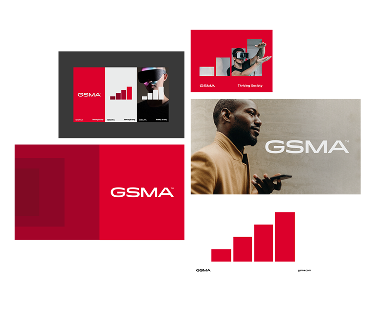
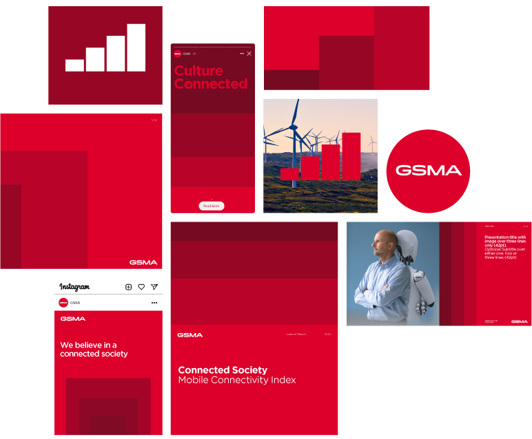
Imagery
Overview
Photography is an ever evolving part of our brand and a core piece of content that brings our world to life. Photography helps connect us to our audience through aspirational and everyday moments.
Section 07
Iconography
Iconography
Overview
Icons make communications materials more interesting. They can help draw attention to content and increase readability. The style of the icons follow a thin keyline design allowing us to integrate more detail whilst still maintaining legibility.
Section 08
Video Assets
Video Assets
Logo & Symbol Animations
A selection of GSMA wordmark and Symbol animations in red and white have been provided for intros and outros for video. Lower-third video templates can also be found at this link.